Create a 32×32 pixel social media icon using Photoshop
Icons can be very tricky to design, the main gripe I have is getting them to look right no matter what the size is. Creating your icon so it's looking all swish 'n' bang is in the detail, just a one pixel line can help add shadows and depth to really bring it to life. Today I'm going to run through my design process of creating my 32x32 pixel Twitter icon, hopefully you'll be able to pick up some techniques and tips on how to get your icons looking sweet.
Step 1 - Create the basic icon shape
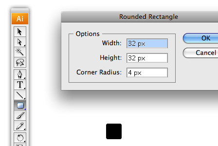
I'm going to use Illustrator to create my shape so it's all pixelly perfect. First make sure your fill is set to a solid colour and your stroke is set to none and select your Rounded Rectangle Tool. Now left click your canvas and enter the following options - width: 32px, height: 32px & corner radius: 4px. You should be presented with a nice sharp rounded square, odd isn't it, we were using the rectangle tool?
A good thing to note here is the difference between clicking and dragging certain tools. With the shape tools, clicking allows you to specify certain values, like the width and height. Where as dragging will let you change these values more visually but at the disadvantage of being less precise.
Step 2 - Get your icon base into Photoshop
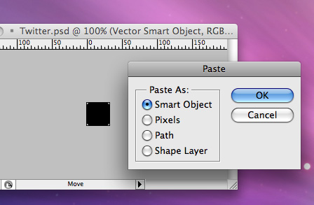
Copy your newly formed shape and then load up Photoshop. Now create a new document (File > New) and hit okay, as you've copied your shape out of Illustrator the document should already be set up and ready for you, magic! Now paste your shape into your document (Edit > Paste) as a Smart Object. If you don't have this option a normal paste will do just fine.
By having your shape as a Smart Object, it allows you to resize your shape without it going all pixelly, great if you're chucking lots of vector shapes into Photoshop. It seems like an element borrowed from Adobe Fireworks to me.
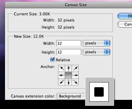
Now the document is a bit tight to our shape, so lets give it some room to breathe by increasing the Canvas Size. First set your background colour to white, then go to Image > Canvas Size and expand the width and the height of the canvas by 32px (make sure you have Relative ticked) so that we have a nice even space around our shape then hit okay.
Step 3 - Add some colour to the base of your icon
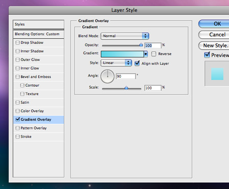
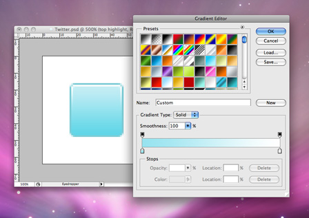
Call this layer base. Now double click your base layer to open up the Layer Style menu & select Gradient Overlay. Use the following options to add a nice subtle gradient, the darker blue is #5CD5E7 and the lighter blue is #C9EEF5.
Why am I using the Gradient Overlay as opposed to just painting one in with the Gradient Tool? Well, for one my shape has curved edges so we might have to get into masks and this could form the basis of a template for creating new icons and all you'd have to do is adjust the colours in the gradient to get cracking on another icon.
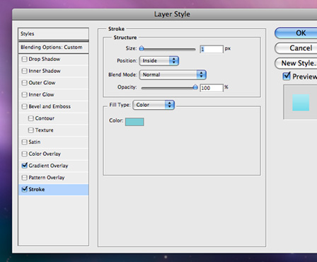
Let's not forget that pixel perfect stroke! While still in your Layer Style menu select Stroke and use the following options, the colour is #7CCCD5.
Using this dark stroke around the shape allows me to give the shape more definition without resorting to in this case, what would be a messy Drop Shadow behind our pixel perfection-ism.
This should give you something looking a little like this now. The gradient is looking pretty smooth at the moment and the colours look quite natural without being too over powering. Then we've got our crisp 1px border around our shape to really define the edges against the background. At the moment though the border blends in too much with the gradient, so lets create even more definition.
![]()
Step 4 - Creating a bottom & top highlight to create more definition
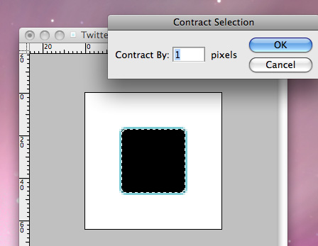
First I want to get the selection of the shape by either CTRL + Clicking on the layer in the Layers panel (or CMD + Clicking), then contracting the selection by 1px by using Selection > Modify > Contract. Now create a new layer and fill the selection with black. You can deselect (CMD/CTRL + D) your selection after doing so.
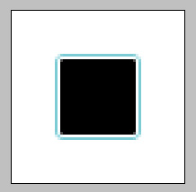
Now create an Inside Stroke of 1px with the colour white using Layer Styles as we did in Step 3. Flatten the layer and call it top highlight.
A quick an easy way of flattening a layer is to create a new layer underneath the layer that you want to flatten, select the layer you want to merge and hit CMD/CTRL + E to merge it into the new empty layer.
Next, create a Horizontal Guide through the middle (at 32px) and chop the bottom half of the layer off. You can hide or delete the guide after this.
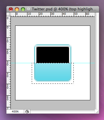
Using the Magic Wand, select the black and delete it, it should leave it looking like this below. A solid 1px border (excluding the bottom) and a pixel in each corner.
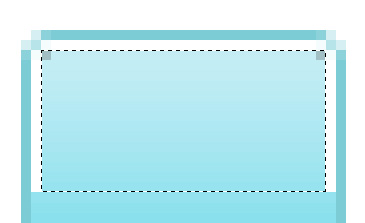
Create a Gradient Overlay on the top highlight with white at the top and it's best to colour pick the bottom colour to match the colour closest to what you have, but it should be around #97E3EF.
Now I wanted to create a lot of depth at the top of the highlight so I chose white to really make it look shiny and bright.
At the bottom I want it to be slightly more subtle so duplicate the top highlight layer (Layer > Dupliate Layer) and name it bottom highlight. Flip it over by going to Edit > Transform > Flip Vertical and move it down so it locks into the bottom.

Open up the Layer Styles menu again and just change the Gradient Overlay so that the white is #97E3EF. This should make it blend in with a slight highlight at the bottom.

Step 5 - Adding in the Twitter logo
Get yourself a source image of the Twitter 't', a quick Google of 'twitter logo' should bring up plenty. Once you've found your image load it up into Illustrator and set your Pen tool up to have rounded ends and draw over the 't', it's a simple shape so it shouldn't take a minute.
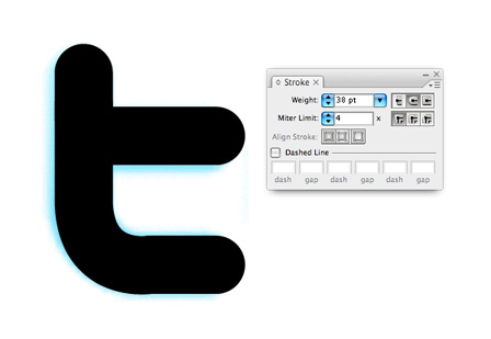
Copy and paste it back into your Photoshop file and make sure it's positioned in the centre, x = 32px, y = 32px. Also add a Gradient Overlay to the 't', the dark blue is #1F96BD and the light blue is #33CCFF. This will give the 't' a nice depth and after the next step it will make it look like it's slotted into our shape.
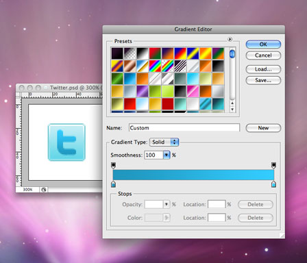
Step 6 - Adding the final touches to the icon
I'm going to add a highlight to the top and bottom of the 't' to give a slightly bevelled look and make it really stand off the background. So let's duplicate the layer we just created, position it underneath the original layer, nudge it up 1 pixel, remove the Gradient Overlay (which should make it revert back to black) and set the opacity to about 40%. You can adjust the opacity depending on how strong you want the bevel to look, it wants to be strong enough to see, but not make it look muddy, which I find it does when it's too dark. Now do the same again, but push the new layer down, add a Colour Overlay of white and set the opacity to 40% and there you have it, you 32x32 pixel social media, Twitter icon.

The finished icon
![]()
I hope you enjoyed my first Photoshop tutorial and it would be great to get any comments to help me advance the writing technique. Please let me know what you found helpful, what was not so hot but if you loved it, please share it around using the social media icons below!
Up coming social media icon set
In the next couple of weeks I will be releasing a set of icons based around this style completely for free, so make sure you subscribe to the RSS feed to be in the know.

32 comments
Danz G (LT) wrote on
Gotta say mate im loving all these free, helpfull stuff you keep posting. KEEP UP THE WORK. Im gonna be trying this but for youtube etc. for my new site..
Thanks kidda!
x
Nouveller wrote on
I’ve got a YouTube one coming, be great to see yours too. Keep subscribed, I’ll release them all in one go.

John Hooton wrote on
The last time I designed icons was back in 1992 using a 16 bit program and doing it pixel by pixel.
Things have moved on and this is a great article on how it is done in 2009. Keep up the good work!
ColdFusion Developer wrote on
Nice tutorial. You can use techniques like this t create icon for just about any applicaion.
Max wrote on
Is it working the same way in Paint.NET?
g3niuz wrote on
nice tutorial …
easy explained
dk3c46 wrote on
Your blog has really impressed me and helped me. Subscribing to your rss feed.
Pingback: 31 Icon Design Tutorials - MaC Donald
Gregory wrote on
Amazing icon set, the tutorial saved my ass! keep up the spectacular work!
Pingback: 31 Icon Design Tutorials | Web Developer
Todd Dawson wrote on
Thanks! Just tried an icon without the smart object base, and it got the jaggies in the corners. Any particular reason why you didn’t use Firefox? Just curious.
Mike Rundle wrote on
Any reason why you didn’t make the rounded rectangle object in Photoshop?
Nouveller wrote on
I just find creating shape in Illustrator a lot quicker and I can easily change the size of it later on by opening up the vector object.
Pingback: 31 Icon Design Tutorials | LearnersTutorials
Pingback: 35+ Great Icon Design Tutorials for Your Designs | [Re]Encoded.com
koidesign wrote on
hi nice work amigo but i wanna to create a icon pack based like this tutorial
i don’t now a bout the licence if it is possibe or not ???
i wait for your answer
freindly
Nouveller wrote on
You’re welcome to. I have created one with this similar technique: http://www.nouveller.com/general/free-social-media-bookmark-icon-pack-the-ever-growing-icon-set/
Manik wrote on
Great stuff. This tutorial is well executed and helpful too.
Thanks for the post.
Pingback: Customize Your Social Media Icons | Martha Winger
mirc wrote on
Natually I’ll give you a link on your web blog. Thanks for sharing…
Pingback: software for sale
photoshop style wrote on
Thank you for every other fantastic article. The place else could anybody get that type of info in such an ideal approach of writing? I’ve a presentation subsequent week, and I’m on the search for such information.
streetstyle wrote on
Excellent points altogether, you just won a new reader. What could you recommend about your post that you simply made a few days in the past? Any sure?
Pingback: mobili per il bagno
Pingback: Celebrity Gossip
Pingback: Icon
Pingback: best service
Vincent wrote on
Hi! I love the tutorial. I was hoping you could answer a question for me on licensing.
Your Social Media Icons pack is astounding, love the quality. But if you are recreating copyrighted symbols (and are even using the originals themselves to trace over), then what extra legal rights does your “free” pack afford the user?
I guess what Im asking is, whats the difference between the legal rights behind your package, and a package that just takes the favicons from the official site and distributes them?
Benjamin Reid wrote on
I’m not 100% sure on the actual legal terms.
But I know that YouTube themselves are using my Facebook icon, and I’m pretty sure if it was against the terms of use – Facebook would have something to say to YouTube about it.
I’m not profiting from them, so I don’t see it being that much of a problem, besides the brands seing it as defacing their artwork.
A good question though, probably best asked to the legal team of the companies.
Thanks for your comment Vincent.
Vincent wrote on
Thanks Benjamin! I was always wondering exactly what the rights are regarding this.
If Youtube/Google is using one of yours then they must have cleared it through their legal team.
Pingback: Create A Button for your Website using Photoshop Tutorials
cringle wrote on
Hello! Quick question that’s totally off
topic. Do you know how to make your site mobile friendly? My weblog looks weird when
viewing from my apple iphone. I’m trying to find a theme or plugin that
might be able to correct this problem. If you have any recommendations,
please share.
Thanks!