Ahh, soak up the inspiration from the new look Styleboost website
I was introduced to this site a long time ago and it was a permanent bookmark until I unfortunately moved machines at work and it got lost in the ether. This was no excuse not to re-bookmark it but I just never got round to it.
A few days ago on Twitter, there was chatter of Styleboost's re-design so I headed on over to discover my web design bible once more.
And wow, what a re-design it is. Styleboost is "an inspirational showcase of incredible sites from around the web", I wonder if it can feature itself?
Anyway take a look at the front page.
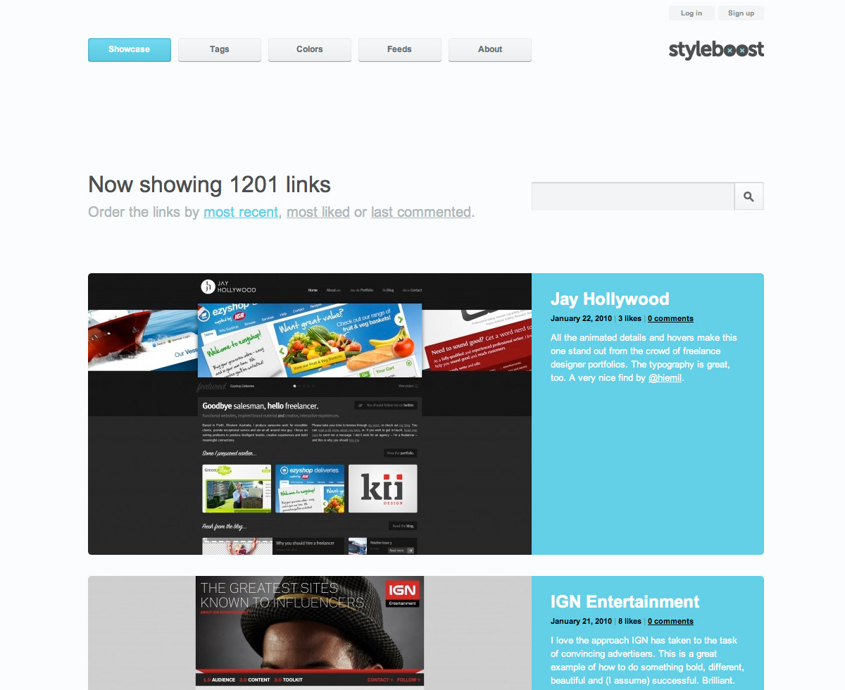
Besides showcasing great websites, itself showcases what I like about web design or even what web design is becoming. It has a clean look to it that somewhat resembles Apple's design but it's much more subtle in it's approach.
A few things that make the design great
Menu/navigation
I really like the subtle drop-shadow and gradient across the buttons (sadly, it's that subtle on my work monitor you can't see the contrast between the background and the buttons). The menu states (normal, pressed, active - from left to right in the picture below) work much like a desktop application, making the buttons appear to be pushed into the page - creating a more satisfying click. This is a really simple but great way to enhance the user experience.

Large content
Bottom line, the content flows really well. Okay, you just scroll down the page like most other sites but the content is allowed to dominate the full width. No sidebar, just a large screen grab of the website and a little bit of detail. Content is king, right?

White space
Yum, me likes white space and we have lots of it here. Our monitors are slowly getting larger so there's no excuse to squish your content up, white space is your friend. It's as simple as this, nav, white space, content.

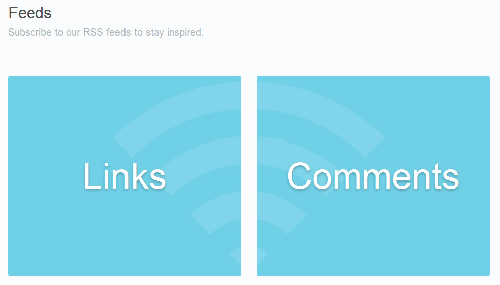
No jibber jabber
You want the feeds for the website, so you head over to the feeds page. Instead of being greeted by a pargraph of text which you probably won't read anyway, you get smacked in the face by two massive buttons giving you different things to subscribe to, I love this!
Large input fields
Having these over-sized input fields makes it a cinch to sign up. Something which has become quite popular recently. No more squiniting at our screens!

Any who
I could go on but go poke around for yourself by paying Styleboost a visit. Make sure you're following Styleboost on Twitter too to keep bang update with new websites that get posted.
2 comments
Johan Bakken wrote on
Thank you so much for the nice words, Benjamin. I am humbled.
Nouveller wrote on
You’re welcome, I’m glad to have Styleboost back.