Nouveller’s refresh is here — Seeker
After almost four years I've finally gotten around to giving Nouveller a little big refresh. For me personally, it's well overdue and is a relief to finally have it finished. Here's what's changed.
Design
I am pointing out the obvious here unless you're a first time visitor that is (if you are, then you can take a look at the old site which is archived at maroonmoon.nouveller.com). The design has had the biggest overhaul including a fixed header for easy navigation, nice crisp type from Open Sans and a clean aesthetic all round.
Logo
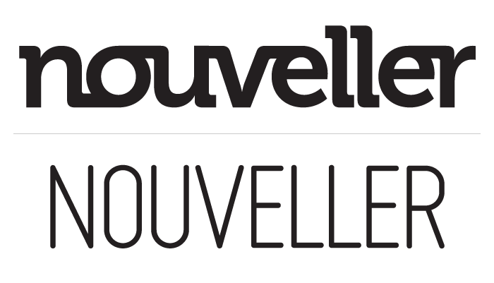
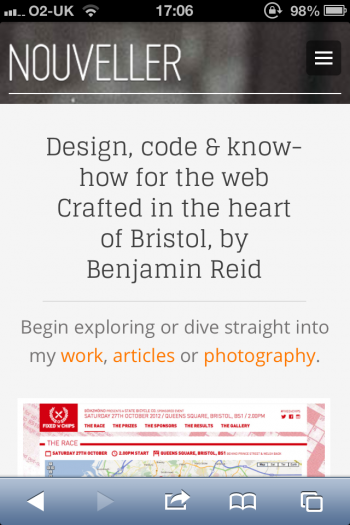
I never set out to "rebrand" Nouveller, but with a new feel in mind, the original logo didn't quite fit. I wanted the new design to feel clean, simple and lightweight so I went looking for a font that would reflect that. This led me to Miso by Mårten Neettelbladt. Using the light version of the font and reducing the tracking quite a bit gave me just what I was looking for, clean and easy to read while still making an impact.

Intentions
Before, I had a grand idea in my head that I'd be writing articles every few days; sharing what I'd learnt and interesting things I'd found, but as time went on I found this wasn't realistically achievable without me melting down.
Instead, it's now a place to show off any new pieces of work and open source projects I've been working on and a place where I can occasionally share something that I think will help out others. However, I am going to commit myself to at least publishing a couple of articles a month (and more if I can).
Resolution friendly
Since coding the original site back in early 2009, a lot has changed with the web from a technical perspective and also how we use it. The new design and code behind Seeker should make content much easier to consume no matter what device you are viewing to it from.

Not forgetting the fun
With building a lot of sites at work and in my spare time you can often miss out on adding "the fun" in because you're working for a client. But with your own site, you can add in as much fun as you like! For example, try taking the lucky dip in the footer.
Me and Keir have been working especially hard on adding some fun to one particular page (you may have seen us tweeting about "#JurassicHack"). I'm going to write an article on exactly what that entailed pretty soon but why not see if you can try find out for yourself in the meantime. Hint: try and get lost.

Comments please
With the new design and thinking behind Nouveller, I know it'll be easy to iterate and improve upon what I've got, whereas with the old design I felt constricted. So I'd love your comments! Anything constructive on how I can improve would be greatly appreciated, this is what I think the web is best at doing.

2 comments
Luke Jones wrote on
Love this, nice and easy to read. Nicely balanced colours, too! WOOP!
iamkeir wrote on
It’s soooo beeeeautiful!