Making the most out a business card as Nouveller goes to print
I've been debating for a few weeks whether to design up and print some business cards for Nouveller, do I really need them? Is it going to be a big waste of money? The answer, no, I don't think so. After receiving my business cards back from the printers I've realised that it's good to have a identity you've created primarily on the web, well all on the web, come to life a bit. This was before all the headache started!
The cards were printed by Aubergine Print from the UK.
Choosing something that I couldn't change after publishing
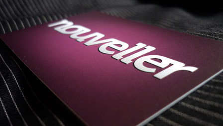
This was a scary thought and something I had no control over. After it had been sent to the printers my end result couldn't be tweaked or changed, a strange thought to have when nearly all your work can be tweaked and constantly updated when working on the web. So it had to be right, thinking cap on.
I first went for first-hand inspiration
I wanted something punchy and simple, that got straight to the point also as it was my first stand alone print job under Nouveller, simple was a good way to go! I looked at a few business cards I had to hand and drew some inspiration from them. Starting from the top left going clockwise, e4education, Urbanz, Jam Factory & Tuddenham Mill.
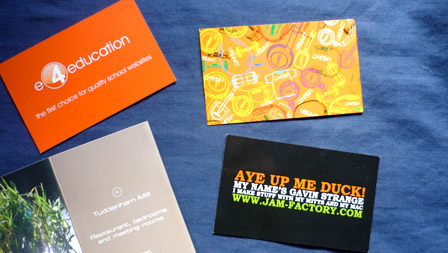
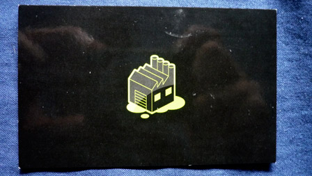
Jam Factory's card really struck me how a business card could be so simple yet so effective. Logo design on the front, what Gavin does and where to get hold of him on the back. There weren't reams of detail like the others, with phone numbers, email address, fax numbers and all other kinds of bits, just a web address.
Front
Back
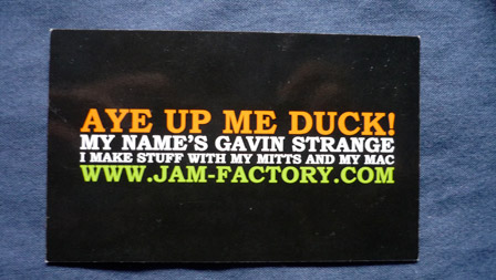
I'd discussed this idea a lot with Jazzybam about slimming down the content of business cards and we both agreed that it seemed to work. So that's what I went for. Below is the artwork before it got sent to the printers.
The final result of my business card madness
Front
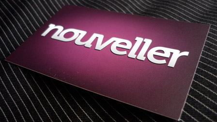
For the front I just stuck to my logo with a nice soft background. Using the colour from my sites header as the deep background to form the base layer, I then added a subtle light in the middle of the design using a Gradient Map in Illustrator to give the card a bit of impact. The glow actually came out better on the printed version that the visual below! I also added a few pixel of solid drop shadow to the bottom of the logo to help it stand about just that little bit more.

Back
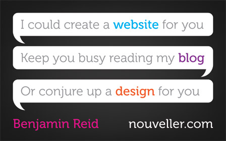
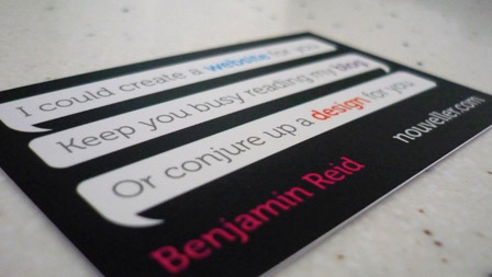
I've followed in the steps of Jam Factory here with keeping the contact information down to just my web address. I played around with a few different ideas but I wanted to say what I did on the back in a creative way and ended up using these instant messenger type bubbles. I tried to convey that it was sort of talking to you and you were in a conversation with it, so I'm trying to tell the receiver of the card what I do in quite an informal and friendly manner.
Some other shots

5 comments
Callum Chapman wrote on
Nice! Really like the outcome man, great job! I should b getting mine soon! They’re coming from America, very slowly I must admit!
Nouveller wrote on
Thanks Callum. Let me know when you receive yours.
Avangelist wrote on
That’s a really nice design concept. I am going to experiment with materials next time instead of font and colour.
I have seen some amazing things with using finishes to create glossed bevels and foils.
Nouveller wrote on
Thanks!
Pingback: e cig