Inspiration : Convertbot iPhone App
I've known about an App' for the iPhone called Weightbot (made by Tapbots) for a while now, heard good things about it's GUI, but never had any reason to own it. While browsing the App Store the other night I came across Convertbot and it was free, so I gave it a download purely based on what I'd heard about it's brother's snazzy GUI.
My firsts words were, "Wow, that is one slick App". The interface is trully stunning in terms of design and usability but to really get an idea of how good this App' is take a look at this video of Convertbot in action.
On loading Converbot you'll notice how well the colours are used to highlight important areas that you can interact with, which is needed as it's not your conventional press here and there interface.
First you select your category to convert by using the wheel in the bottom portion of the screen as you would adjust your volume on the older iPod's and iPod Nano's. Once selected, you then hit the left and right values to choose your unit to convert, again using the wheel which just works (that's not an Apple reference).
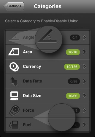
What really blows me away is the attention to detail in just about everything. The categories screen is using two, one pixel lines to define each category, one dark and one light to give it real definition (you can see this in the zoomed in sections from the screen grab below), this is becoming ever so popular in web design today.
Also another thing that caught my eye was the icons. There are hundereds of different ways you can represent these categories with icons but these are bang on, making it really easy to skim through them all without even having to read!

It's just pixel perfect, well done Tapbots!

10 comments
skyboaceasy wrote on
Household Medicine Eliminate Boils purchase accutane In some cases the treatment can be continued for nine months. http://www.atchafalayaseafood.com/ – order isotretinoin
Klonopin wrote on
ysuojopvwfmmfs, Klonopin tablet, qfxPzVC, [url=http://www.klonopinpanicattackrx.com/]Klonopin anxit[/url], oXivJlU, http://www.klonopinpanicattackrx.com/ Klonopin for neck pain and headache, fwayeLm.
Viewtopic.php .fr fioricet wrote on
zqwysopvwfmmfs, Viewtopic.php .sa fioricet, MZqjxBz, [url=http://www.larryllowe.com/]Fioricet epad.cgi[/url], kTSvCVT, http://www.larryllowe.com/ Viewthread.php .nf fioricet, kdCmJeq.
Psoriasis wrote on
lbwbiopvwfmmfs, Psoriasis Treatment, xVFaQrh, [url=http://www.diethealthsite.com/psoriasistreatment/]Psoriasis[/url], XMqQvrA, http://www.diethealthsite.com/psoriasistreatment/ Psoriasis Treatment, wJjkMzs.
Clomid wrote on
axuvoopvwfmmfs, Can clomid cause your period to be late, VvzVUEN, [url=http://www.druginfo4u.com/ovulation-induction/clomid/]Discount clomid[/url], rqyQWfD, http://www.druginfo4u.com/ovulation-induction/clomid/ Buy clomid without prescription, LINcvOe.
Online generic klonopin wrote on
liyqxopvwfmmfs, Purchase klonopin affordable price, HJBVguD, [url=http://www.alderleytennis.org/]Buy klonopin uk prescription[/url], melWWtK, http://www.alderleytennis.org/ Buy klonopin overnight, Orarpfm.
renault logo download wrote on
Thanks for such an excellent post. It certainly made my day. It is such a pleasure to look forward to your post. Excellent ideas and valuable inputs is what I always look forward to from your end. I am sure all the readers are going to find this extremely helpful.
Buy levitra online viagra wrote on
vbktwopvwfmmfs, Women and levitra, ziHqKMi, [url=http://obirisbooks.com/]Compare viagra to cialis and levitra[/url], ltYdIWe, http://obirisbooks.com/ Levitra for sale, qpKqYtb.
horny wrote on
2GMQV7 http://www.90SGZoHdWfN8O69Bluk0u450TSMCkjf6.com
tube8 wrote on
Asking questions are really good thing if you are not
understanding something totally, but this paragraph gives nice understanding yet.